Who does not know nowadays what is the audi logo? It is one of the best-known images in the automotive industry of recent times. Recognized as one of the most prestigious German car manufacturing companies today, whose logo contains a great history.
The four circles of the well-known German car manufacturer have a deeper meaning than most people think. Here we are going to take a tour of its history, so that you can understand what does the Audi logo mean. You will also learn how it was born and how it has evolved.
What does the Audi logo mean?
Beyond an elegant logo, the 4-ring Audi car logo represents the four companies that merged in the 1930s. Four interlocking rings symbolized the merger of four car manufacturers based in the state of Saxony in Germany.
These were the manufacturers, ‘Horsch/Audi/DKW/Wanderer’, who combined to form ‘Auto Union AG’. Subsequently, start-up companies took on the Audi name. The new company very quickly became one of the world’s leading car companies. Today’s Audi logo is a simple design with four interlocking rings. The design is sometimes accompanied by the ‘Audi’ wordmarkwhich is built with a fancy font.
Audi logo evolution
Prelaunch year 1909
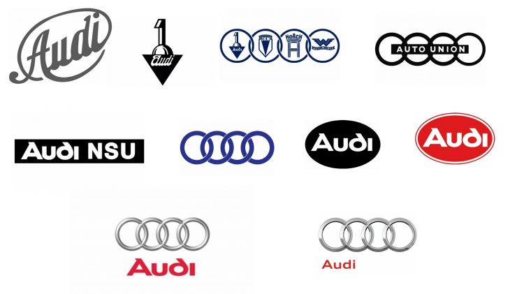
The Audi’s first logo was introduced in the year 1909 and it was a pre-release version, it was composed of a cursive inscription located diagonally in an oval outline. This logo was designed in a dark gray, which looked professional and strict.
Badge created in the year 1909
The 1909 badge was only used by Audi for a few months and was later replaced by its modernized version that same year. This badge consisted of a large number ‘1’ coming out of a sphere. This was half hidden behind a black triangle, which was pointing downwards.
The ‘Audi’ wordmark was written in narrow white cursive on a black background.
Logo from 1909 to 1932
In that same year, in 1909, an official insignia was created, which consisted of a solid black triangle pointing downwards with the sign of the number ‘1’ above it and the word mark on white italics with smooth, thick lines on the top line of the geometric figure. This logo was used by the car manufacturer until 1932, when Auto Union was formed.
Logo from 1932 – 1949
The original Auto Union logo it featured four blue rings. The emblem of one of the four brands was drawn on each ring, also in blue. The brands were ‘Horsch/Audi/DKW/Wanderer’.
Logo from 1949 – 1969
In 1949 the logo is simplified into the four rings of the logo and replaced by a thin horizontal rectangle, which crosses the rings in the middleit read Auto Union in capital letters.
Logo of the year 1969
In 1969, another logo was introduced. It was a simple, horizontally stretched black rectangle with the Audi corporate lettering in white on the left side accompanied by NSU in white capital letter on the right.
Logo of the year 1969 -1995
Auto Union becomes Audi and the rectangular strip of the logo is eliminated. The emblem is made up of four thick blue rings, chained together as a symbol of strength and confidence..
Logo of the year 1969 – 1995
There was also another logo, which was created in the same time period: bold white letters with a rounded shape of the ‘d’ placed inside a solid black oval, located horizontally.
Logo of the year 1978 – 1995
The same design as the previous one with a red oval and white letters to create a better contrast and a more striking logo.
Logo of the year 1995 – 2009
In 1995 2 emblems become one. The logo consisted of a symbol of three-dimensional silver rings with bold red letters.. The thin, delicate contours of the rings form a brilliant balance with their wordmark. This adds a unique and elegant touch to the whole image.
Logo of the year 2009 – 2016
In 2009, the logo became more refined, the rings became larger and the nameplate became smaller. The letters changed their typeface to a more traditional sans-serif and somewhat extended in shape. It is now at the bottom left of the logo, with the four rings becoming the center of the logo design.
From the year 2016 to today
In 2016, the logo is simplified and the three-dimensional effects are gone. Now the logo is executed in plain black, with no additional lettering. Four rings with more space in the overlapping areas, looking powerful and elegant.
What does the Audi logo mean today?
As we have seen throughout the evolution of its logo, Audi made changes to the ownership and structure of the manufacturer. Today, the Audi symbol remains the same as it was when the initial launch of the Audi brand occurred.
When Audi joined with three other companies to create Auto Union, the 4-ring design was a way to represent all the participating companies. It then officially changed its name to Audi, so the 4 interlocking circles design remained a testament to the origins of this company.
The Audi logo encloses the very history through the years of what Audi has represented. The simplicity of the Audi logo is also much easier to remember than some alternative designs.
Today, the Audi logo represents one of the most memorable and well-known car logos in the industry. Its simple design is easy to recognize, yet looks powerful.whether you see it through an online ad or in the back of a car when driving down the road.


